It is a known fact that images always get higher impression and engagement rates than words or numbers. An adage says, “a picture is worth a thousand words.” In fact, research and studies showed that any form of information, be it an article or a Facebook post, gets higher engagement rates and is understood better when including some sort of visuals.
Charts are a form of visual that have a similar effect. Imagine tons of data in a single spreadsheet without any image, and imagine how strange it would be to communicate with your audience that way. And here come charts that help you convey and display your information visually better. They are effective tools to showcase the data quickly, easily and in an eye-catching way, which tables and other visuals sometimes cannot do.
In this article, we will learn the 5 best chart maker apps that will help you improve your communication between you and your audience.
1. LiveGap Charts
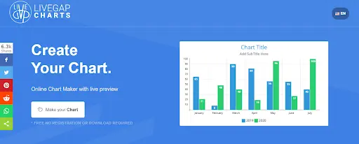
LiveGap is a user-friendly web-based chart-building platform enabling users to access various charts and full customization freedom over them. It has 11 chart types available, which allows users to find the best fit for their data. It enables a live preview to see how the chart will look like in real life and a set of designing tools for adjusting the charts to your preferences.
Key Features of LiveGap Charts
- Web-based chart maker
- 11 chart types (line, area, bar, horizontal bar, stacked bar, stacked horizontal bar, pie, doughnut, polar area, step, and radar charts)
- No registration or download required
- Manual data entry, or copy of Excel or any other spreadsheet
- Live preview
- Plenty of customization options
- 50+ chart templates
- Chart animations.
How to Use LiveGap Charts
- Go to LiveGap’s website
- Tap on “Make your chart”
- Choose the chart type
- Introduce your data manually/ from a spreadsheet
- Save online/Export as an image
2. Datawrapper
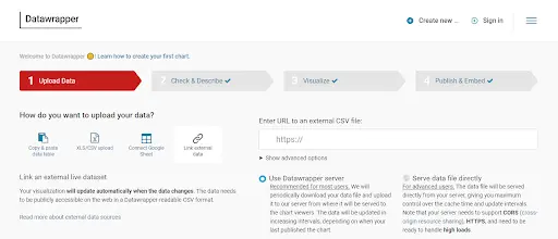
Datawrapper is a web-based data processor and chart maker allowing users to create charts, maps, and tables. With Datawrapper, you can either insert your data manually, or upload CSV/XLS files, connect it to Google Sheets, or link to external data. It has 20 chart types available with all the designing and customizing tools to make your chart visually appealing. Datawrapper has a fairly well-designed and user-friendly interface making the process of chart building easier.
Key Features of Datawrapper
- Web-based chart maker
- Various data upload options (manual, CSV/XLS file, Google Sheets, external data)
- 20 chart types (Bar charts, Column charts, pie charts, doughnut charts, etc.)
- Translation
- Embed code (shortcode) via email
How to Use Datawrapper
- How to Datawrapper
- Tap on “Create new” and select “Charts”
- Enter your data (either manually or from a database)
- Choose your chart type
- Customize
- Enter your email to get your chart’s shortcode.
3. Freelo
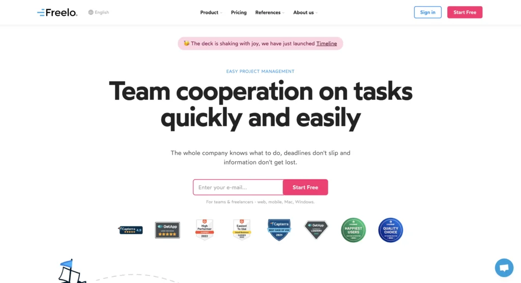
Freelo is an intuitive collaboration tool that helps freelancers and teams with complete control over their projects. With its user-friendly interface, you can effortlessly organize your projects into To-Do lists, tasks, and subtasks, which can be easily delegated to team members. Keep track of your team’s progress by monitoring their time and activities, while managing budgets and hourly rates with ease. With the help of their calendar and Gantt chart, you can plan ahead and manage recurring tasks by creating process templates.
Key Features of Freelo
Freelo provides a plethora of features, including but not limited to:
- Kanban boards,
- Mindmap,
- Time tracking,
- Integrations with third-party tools,
- API, and more, making it a versatile solution for various industries, from Marketing to Regional Offices.
How to Use Freelo
- Go to Freelo
- Sign up/ Log in
- Choose your boards, mindmaps, etc.
- Edit to your preferences
- Change the design
- Click save
4. Project Office X
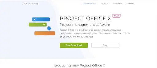
Project Office X is a project management app based on the Gantt method. One of the things that sets Project Office X apart from other project management tools is its ease of use. And because it’s available on both macOS and iOS devices, it integrates seamlessly with other Apple apps and services.
Key Features of Project Office X
- The Gantt chart view that graphically displays each task on a visual timeline and the outline view that presents tasks, groups, and milestones in a spreadsheet format.
- Resource and base calendars that specify unique schedules for specific resources, making it easier to assign and distribute workloads
- Baselines to track progress, identifying bottlenecks in your project, and critical path analysis. You can also share projects and reports with colleagues and back up your projects to iCloud.
The Pro version of Project Office X has even more advanced features, such as:
- Microsoft Project® (XML) export/import and the Network Diagram view.
- The MS® (XML) export/import allows to easily exchange the project files.
- The Network Diagram represents a graphical flow project that is used to map out the project schedule, and track its progress and completion.
5. ChartBrick
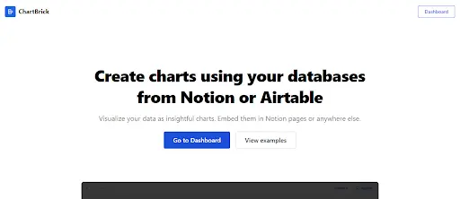
The last chart maker app in the list is ChartBrick. ChartBrick is an easy-to-use and no-code data visualization tool allowing users to create insightful charts using the data from Notion, Airtable, CSV, JSON, MySQL, and more data. Users can easily transform their data into visually appealing charts that can be embedded into Notion pages or any other website.
It is simple to create charts in various types, including column, bar, line, area, pie, donut, and radar, without any programming knowledge. ChartBrick offers a range of customization options, including the ability to:
- aggregate,
- filter and
- sort data,
- choose from multiple themes, and
- switch to dark mode.
It is also privacy-oriented and provides users with real-time charting, ensuring that charts always display the latest data.
Key Features of ChartBrick
- Various data sources – Notion, Airtable, JSON, CSV, and more
- 7 chart types – Column, bar, line, area, pie, donut, and radar
- Privacy – no data is stored
- Dynamic – displays the latest data
- Customizable
- Responsive – charts adapt to any screen size
- Embedded – can be displayed on any website or webpage
How to Use ChartBrick
- Go to ChartBrick
- Sing up/Log in
- Connect ChartBrick to your database
- Choose your chart type
- Customize to your preferences
- Download the chart as an image or copy and paste the shortcode on your desired page.
Final Thoughts
Charts are widely used in this highly-informative era. Representing the information with charts can make communication between customers and employees quicker and seamless.
For this, we have introduced you the 5 best chart maker apps that will help you in the following:
- Visually representing complex information,
- Comparing between variables,
- Designing the most eye-catching charts,
- Building various charts to represent your data to its best.
All charts enable its users to insert data by connecting to either Google Sheets or Excel instead of filling the data manually, which can be quite challenging. Some suggest additional sources for introducing your data, such as CSV/XLS files and external data.
All you have to do is to test out the chart makers and find the one that fits you the best based on your needs and preferences.
Do not forget to share your experience with us!
- Understanding How Dropshipping Product Research Tools Work - November 26, 2024
- ISO 27001 Compliance: How To Secure Your Information Assets - November 25, 2024
- SaaS Security Best Practices for Protecting Business Data - October 3, 2024